
Logtivity is a WordPress activity log that we launched this summer. Not only can you track all the activity on your site, but with Logtivity you can also turn that information into beautiful and useful charts.
We use the charts all the time in our other business. You can use these charts to show logins, purchases, subscriptions, cancellations, downloads, or any other key events.
Logtivity charts just got a lot better because you can customise the date range for charts. Your charts are updated with advanced date ranges, so you can zoom in to view any time period.
The improvements rely heavily on two open source projects:
- Chart.js, which is a very popular, community-run, open source project. My guess is that, without realizing it, you’ve seen examples of charts built Chart.js all over the web.
- Date Range Picker gives us super flexible filtering options. You can show two pop-up calendars for the start and end of the date range. Users can select dates, times, and also predefined ranges such as “Yesterday”, or “Last 30 Days”.
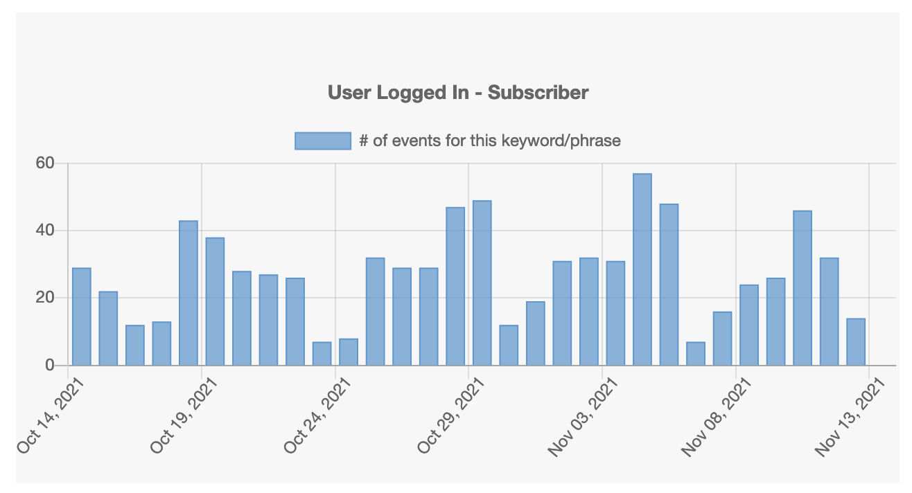
Here’s an example of how the charts look. This is a daily chart of logins by users in the “Subscriber” role to PublishPress.com.
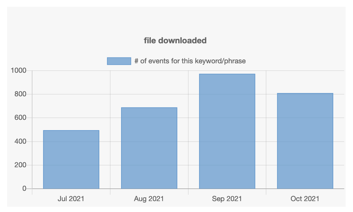
You can zoom out and see this data on a monthly or annual level. This image below shows the monthly number of file downloads from users at PublishPress:
If you like what you see, click here to see more details on the Logtivity charts.